March 28th Readings

•April 2, 2007 • 1 Comment

I had meant to post this last response to the readings from work on Wednesday, but the CBE network was not enjoying WordPress for most of the week. In fact the whole network seemed sluggish. Anyway, here is my response to Norman’s Epilogue: We Are All Designers in Emotional Design.

I want to begin my last response post by saying how much I have enjoyed Norman’s book. It constantly made me think, make connections to other things that I have read or seen, and nod my head with approval and understanding. I am passing it on to my wife, who has seen me reading it, I think she’ll enjoy it because of her background in psychology.

I would like to emphasize a few concepts that Norman discussed in this chapter, specifically personalization and customization. Norman asks questions like, “how can mass-produced objects have personal meaning?” and yet for many people that already do, without the need for any customization. Some people love objects that have been mass-produced, and they form personal attachments to them. Take for example, Pottery Barn, or any other company similar to them. They sell what appear to be unique curios, but really many of your friends and neighbors might have the same apothecary table. Are there truly unique products out there in our mass-produced mass-consumed culture?

Although there are customization services available to consumers for some products, there really are a fixed number of choices, styles, colors and materials. I hope that Norman’s idea of “mass customization” becomes more commonplace, and will extend to everything. Currently, computer manufacturers like Dell employ a “just-in-time” manufacturing model. Items are only manufactured after they have been purchased, so there’s no stockpile, which, in turn, reduces the cost of inventory. On a very related note, in Thomas Freidman’s book The World is Flat, he discusses in great detail the manufacturing and supply chain operation of Dell’s operation. Here are some interesting facts about Dell’s operation which I am taking from Friedman’s book (pages 515-519):

  • Dell has six factories around the world: Limerick (Ireland), Xiamen (China), Eldorado do Sol (Brazil), Nashville (Tennessee), Austin (Texas), Penang (Malaysia)
  • Orders are sent by e-mail to the various factories
  • parts needed for every individual order are sent to supplier logistics centers (SLCs)
  • around every Dell factory there are SLCs, owned by the different suppliers of Dell parts
  • in an average day, Dell sells 140,00 to 150,000 computers
  • those orders come over the phone or through Dell’s website
  • as soon as the orders are taken, the suppliers at the SLCs know about it
  • every two hours the Dell factories send an e-mail to the various SLCs telling them what parts are needed and the quantity
  • parts are delivered 90 minutes later
  • all parts are unloaded in 30 minutes and bar codes are entering into a tracking system
  • Dell has multiple suppliers for most of its key components

In his book, Friedman goes through all of the various parts and components and their origins (where they were manufactured) because he wrote the book on a Dell Inspiron notebook and wanted to know all of the global connections that made this piece of technology “tick”.

Norman also discusses how we, as individuals, are designers in our every day lives, because we manipulate the environment in which we live to suit our needs, we select items to own, we build, arrange and restructure. Through our designs, we transform houses into homes, spaces into places, and things into belongings. In my everyday life I maintain a personal website and weblog for both myself and one for my son (my wife has one too, although she doesn’t update it very often). These are also, according to Norman, to be personal, non-professional design statements. But how individualized can they blogs be when they come with pre-packaged templates that everyone uses? Where is the personal customization? This is something that I wish blogging services like Blogger would offer, far greater customization and personalization of blogs.

March 21st Readings

•March 22, 2007 • Leave a Comment

Here is my presentation from last night’s class:the-social-life-of-learning.ppt


March 14th Readings

•March 18, 2007 • Leave a Comment

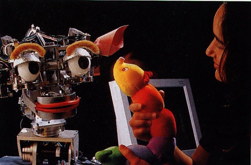
For this post I’m going to focus in on Chapter 6 in Norman’s Emotional Design entitled “Emotional Machines”. In this chapter Norman discusses the future of robots and machines, an the need for them to have some level of emotion in order to perform their tasks better. Norman writes,”as robots become more advanced, they will need only the simplest of emotions, starting with such practical ones as visceral-like fear of heights or concern about bumping into things.” More complex emotions, such as anxiety about dangerous situations, pleasure, pride in the quality of their work, and subservience and obdience with also have to be programmed into their systems. The one part of this chapter that I wanted to focus in on was the section on Kismet, the emotional robot built at M.I.T.

kismet-toy-zoomcopy.jpg

I’ve seen features on this robot before on Discovery Planet, and it is very interesting work. Kismet uses cues from the underlying emotions of speech, to detect the emotional state of the person with whom it is interacting. Kismet has video cmaeras for eyes, and a microphone with which to listen. Additionally, Kismet has a sophisticated structure for interpreting, evaluating, and responding to the world that combines perception, emotion, and attention to control behavior. Despite the fact that Kismet can react appropriately to someone talking to it still lacks any true understanding, and it can get bored of certain interactions and look away. I guess we’re a long way from having a social interaction with a robot, that can truly understand our behavior, and that might not be such a bad thing.

March 7th Readings

•March 18, 2007 • Leave a Comment

Wow, am I ever out of the flow with posting my responses on the blog about class readings. I think I’m still recovering from Reading Week and doing report cards and parent-teacher interviews. Things got a bit busy there, but hopefully I can catch up with what I have to do.

I’ll focus in on a couple of Nielsen’s readings for this post, namely, “First Rule of Usability? Don’t Listen to Users?” which is an article from 2001. Nielsen summarizes his article by stating “to design an easy-to-use interface, pay attention to what users do, not what they say. Self-reported claims are unreliable, as are user speculations about future behavior”. Nielsen further goes on to state that the way to get user data boils down to the basic rules of usability:

  • Watch what people actually do.
  • Do not believe what people say they do.
  • Definitely don’t believe what people predict they may do in the future.

I tend to agree with Nielsen on these points. There may be some unpredictable uses for any given device that users test, and it is better to do field observation to see how they actually use a device.

The next Nielsen reading centered on “Why You Only Need To Test With 5 Users”. It is Nielsen’s contention that you only need to have five potential users test any given product, and that to spend more resources on product testing is a waste of resources. In the article, Nielsen uses a graph to illustrate his point. The graph basically illustrates that after 5 users you’re not really getting any new quality information or finding any usability problems. In some respects, I can understand this thinking, but I don’t know whether this would be a truly representative sample of all potential users.

February 14th Readings

•February 14, 2007 • Leave a Comment

I had a chance to read over Jakob Nielsen’s “Top Ten Mistakes in Web Design”. Going in to this reading I was curious to see how many of these mistakes I had made in the past with websites that I had designed. In summary, here are Nielsen’s Top Ten Mistakes:

  1. Bad Search
  2. PDF Files for Online Reading
  3. Not Changing the Colors of Visited Links
  4. Non-Scannable Text
  5. Fixed Font Size
  6. Page Titles with Low Search Engine Visibility
  7. Anything That Looks Like an Advertisement
  8. Violating Design Conventions
  9. Opening New Browser Windows
  10. Not Answering User Questions

Some of these I can agree with wholeheartedly. I think one of the strengths of search engines such as Google is that when you make a typographical error, it will still pull up a results page, but it will also ask you “Did you mean…?” Most websites that have a search engine included tend to be a bit picky, unless they are powered by Google. I’m not sure what he’s talking about with the whole PDF complaint. I hope he isn’t saying that you shouldn’t PDF links on pages because I’ve done that before. I’ve never come across a website that was entirely PDF format included (unless he’s taking about websites that use frames). I have to disagree with Nielsen when he writes about opening up new browser windows. I have found it easier to have files open up in a new browser window. When I’m finished with that document or picture I can just close the window. I don’t get lost. I could see how a web surfing beginner might have issues, but isn’t that what breadcrumbs are for? A case in point, is the hyperlink above. I have it set to open in a new window because I don’t want readers to lose track of where my blog is located.

As for Jeff Caird’s research on driving with cell phones and other digital distractions. That’s just common sense. I think we’ve all seen TV news magazine shows that demonstrate how teenagers are being distracted behind the wheel due to all of the distractions. It’s just common sense. That’s one of the things that I miss about driving a standard, there’s too much to do (driving wise) to be playing around with cell phones, eating, using an electric razor, putting on make-up. I think everyone should have to learn to drive a standard. I find myself getting bored and complacent behind the wheel if there’s not enough technical skill involved.

February 7th Readings

•February 7, 2007 • Leave a Comment

I don’t know about you, but my titles for my posts are getting progressively less creative. At any rate, I will be making some comments about this week’s readings, namely Nielsen’s article about usability for children’s websites, the University of Saskatchewan website on classic design theory, and Garr Reynolds website called “Presentation Zen”.

Some interesting quotes struck me as significant in the Nielsen article, in particular the following: “the idea that children are masters of technology and can defeat any computer-related difficulty is a myth. Our study found that children are incapable of overcoming many usability problems. Also, poor usability, combined with kids’ lack of patience in the face of complexity, resulted in many simply leaving websites.” I think as adults we always seem to assume that our students are “digital natives” and are far more tech savvy than many adults. Obviously, Nielsen’s study counters this assumption. The bottom line is this, you can not assume that your students, your potential target audience, will intuitively understand your website’s design and navigation.

Another important understanding that I gained through reading Nielsen’s article was that “children want content that is entertaining, funny, colorful, and uses multimedia effects. However, for homepage design and navigation systems, the user interface should be unobtrusive and let kids get to the content as simply as possible.” In other words, simplicity, but not overly simplistic design and navigation is what we as designers should strive for in our project designs. We must be very cognizant of our target audience, and the ease of using our project.

I feel that the University of Saskatchewan website might be useful in learning about the basic principles of design, color theory, balance, use of texture, and perspective. It might be a resource that I will refer to in the future.

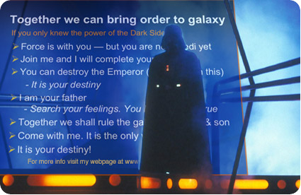
I really love Garr Reynolds blog and website. I have bookmarked both of his websites, and I refer to them often. I now find myself reexamining my own practice of using PowerPoints in class, and I do feel that I belong to the Darth Vader school of “evil PowerPoint”. I have too much text on my slides, and they may not be the most aesthetically pleasing. On the other side of the coin, I do tend to send students the presentations that I do in class, so they have awesome notes to study from, and they don’t have to write any notes in class (which many students appreciate). I have tried with any new presentation that I have made recently to try and keep it more simple in its design and layout, so maybe I can learn some new tricks from this website. Ultimately the goal is to transform this:

darth_prezo.jpg

To this:
yoda_prezo.jpg

Cleaner, clearer presentations, with less text, but still informative. Now, how can I this grammar checker get to work?

January 31 Readings

•February 5, 2007 • Leave a Comment

I’ve been a bit busy lately, so I’m a little negligent in posting my responses to the readings. For the purposes of brevity, I’m going to just respond to a couple of the readings, namely, Chapter 4 from Norman’s Emotional Design and the reading “What is interaction design?”.

In Chapter 4 of Emtotional Design one particular quote spoke to me, and that was “technology should bring more to our lives than the improved performance of tasks: it should add richness and enjoyment.” One thing that I was really happy to see discussed also in this chapter was the Japanese bento box, and how it truly is an artform. Having lived in Japan for awhile, this discussion appealed to me because someone else appreciated the aesthetics and beauty of the presentation of food as it happens in Japan. Truly some bento boxes are “art meant to be consumed”.


Another part of Chapter 4 which I feel will be helpful in designing our project will be Patrick Jordan and Lionel Tiger’s work on designing pleasurable products that Norman alluded to in this chapter. This can be summarized as the following:

  • physio-pleasure (which appeals to the visceral and behavioral levels)
  • socio-pleasure (which appeals to the behavioral and reflective levels)
  • psycho-pleasure (behavioral level)
  • ideo-pleasure (reflective level)


Three Levels of Design

•January 25, 2007 • Leave a Comment

Hmmmm. WordPress was being tempermental with me these last couple of days, so I had to start this post all over again, so it might appear slightly different from its original format.

I’m really enjoying reading Norman’s Emotional Design. When I’m reading this book I’m constantly being reminded of other examples of design that I’ve read about or saw on TV, of which I’ll share a few in this blog posting. Norman begins Chapter 3 discussing the distinctive packaging of water bottles, and how design becomes the product. I’m not sure what Norman would say about this particular product, something definitely gets lost in translation.

pocari-sweat.png

The three levels that Norman discusses in the chapter are visceral, behavioral, and reflective. At the visceral level the physical dominates, so the look, the feel and sound are most important. The principles underlying visceral design are wired in, and are consistent across people and cultures. People go through these stages/questions when looking at a product designed to appeal to the visceral level: “I want it.” “What does it do?” “And how much does it cost?”. Norman raises some great examples of products that appeal to the visceral level, including iMacs, the VW Beetle, the Audi TT, and the Chrysler PT Cruiser.At the behavioral level performance matters. The most important components of the behavioral level include: function, understandability, usability, and physical feel. The key quote that jumped out at me was, “the first good step in good behavioral design is to understand just how people will use a product.” A lot of times designers/engineers are set in their ways, and they may not anticipate a need unless they observe it firsthand. There is a bit of a disconnect between designers and the people that they are designing their products, their intended audience. Norman also brings up numerous examples of products/innovations that designers have made in the past that even the designers didn’t aniticpate their ultimate use, the classic example being Thomas Edison thinking that the phonograph would replace the need for people to dictate letters to one another.

Norman mentioned a design firm called IDEO in this chapter, which reminded me of a story that Nightline did on this company in 1999. In this piece, Nightline gave the designers a task: redesign a shopping cart. The designers started out brainstorming issues/problems associated with the traditional shopping cart. At the end of the challenge the designers came up with this design:

shopping-cart.png

An interesting approach indeed. Some of the advantages of this new design were increased manueverability of the cart, plastic carts to hold groceries, and a scanning device that would ultimately allow people to do a self-checkout. Will this be the shopping cart of the future. Maybe, maybe not. Consumers who tested the product were concerned about forgetting to scan the products, and many also remarked that they missed the human exchange with the checkout clerk (personally, I could do without this part of grocery shopping).

Usability Engineering: Executive Summary

•January 17, 2007 • Leave a Comment

I had an opportunity today to read/skim over the first chapter in Jakob Nielsen’s Usability Engineering entitled “Executive Summary”. Admittedly I only skimmed this chapter for a few minutes, but what I feel might be most useful in designing a project would be the usability slogans section (p.10-16). These simple slogans/maxims might be good to refer back upon when designing our project:

Your Best Is Not Good Enough

The key thing to remember here is “your design will be much better if you work on the basis of an understanding of the users and their tasks.”

The User Is Always Right

The developer needs to develop some humility and acknowledge the need to modify the original design to accomodate the user’s problems.

The User Is Not Always Right

Users often don’t know what’s good for them.

Users Are Not Designers

You can’t expect novice users to make their own modifications to products. The initial interface is needed to support novice users.

Designers Are Not Users

Designers can assume that their own intuition about user interface issues, since they do not share some important characteristics of the real users. For example, a software designer might look at an error message and believe it makes perfect sense (due to their deep knowledge of the system’s operation), but to an average user it may incomprehensible.

funnywindowserror1.png

Vice Presidents Are Not Users

Vice presidents and other corporate executives should realize that they are no more representative of the end users than the developers.

Less Is More

If everything is there, then everybody should be satisfied, right? Wrong.

Details Matter

Systematic usability enginering is necessary to ferret out the details sometimes. Something as simple as instructions can cause problems/confusion.

Help Doesn’t

Sometimes online help and documentation doesn’t help users. It is always better if users can operate a system without having to refer to a help section.

The Multiple Faces of Emotion and Design

•January 17, 2007 • Leave a Comment

After reading Chapter 3 in Norman’s Emotional Design a few items struck me as being important when designing products. Thinking about designing a product that appeals to a consumer at a visceral, behavioral, and reflective level would be quite difficult. Norman points out that “no single design will satisfy everyone” due to variations in culture, personal tastes, and other factors. I found the reference to the Microsoft XBOX ad to be interesting: “Go outside. Get some air. Watch a sunset. Boy, does that get old fast.” Personally, I don’t remember these ads, maybe I’m outside the target demographic, and I’m not watching the right TV shows to see these ads, or I’m not reading the right magazines either. Which helps illustrate the point of market segmentation. Producers of mass consumed products know that they aren’t going to reach everyone, so they target their little market niche. Also, the XBOX ad pits the reflective level against the visceral and behavioral thrills that you can get from playing an XBOX game. Norman also points out that “with the large range of individual, cultural, and physical differences among the people of the world, it is impossible for a single product to satisfy everyone.” True. But what about products that seem to dominate the marketplace (no I’m not going to ge into the Mac vs PC thing again), but how do you explain the popularity of a product like the iPod in its various incarnations? Is it simply a matter of better marketing? Doesn’t the iPod’s popularity span various age demographic groups? Does emotional design have a role to play in the popularity of a product like the iPod?  

ipod13.png